Friday, December 6, 2019

Josh's Sandwich Shop

Affordable, hearty, and healthy sandwiches available to-go or to-order. Open from 5:30am to 3:00pm every day. The sandwiches are made fresh every day from locally sourced and well-balanced ingredients. Our goal is to feed people a healthy breakfast or lunch to-go that they can afford to grab daily. Vegetarian and vegan options are readily available. Orders can be picked up off the premade menu, placed on the spot and made to order or ordered beforehand online for quick pickup.

Audience/Customers:
Catering to commuters and students with limited time to spare for breakfast and lunch. All income brackets are included but the sandwiches are advertised as affordable.

Personal Preferences:

I like minimalistics designs using basic shapes and only a few colors. I tend to like orange shades, my favorite being #f88000, but I’m open to suggestions. The company name could be abbreviated if needed, it is sort of long.

Thursday, November 21, 2019

Peer Critique: Clocking Out

How many ways can someone pretending to be happy in the corporate world potentially off themselves? There are several not so subtle methods indicated in the scene among a backdrop of the classic bullshit corporate motivational posters. The expression that Rey has of pretending everything is great to appease his boss but masking a deep emptiness and dissatisfaction is just spot on with what I've seen myself time and again in corporate offices.

The title is excellent! I actually laughed a little bit out loud when I opened the poster, as I had seen the title before I started but not the visual design... not at all what I was expecting to find and I still get a kick out of it. The motivational signs are well done, just bland and vague enough to not convey anything important while also instilling a feeling that they are supposed to and you just don't get it. Incorporating the title into one of these posters is cheeky and fun, adding to the bizarre nature of the scene.

My criticism lies mostly in the detail work of the various elements. The composition is there: the perspective of the desk, the placement of the various lethal items, and most importantly the scale and perspective of Rey; all effective and well placed. I think the edges could be cleaner, shadows worked out more and the angle/perspective of the items of the desk could be manipulated to look more realistic.

Peer Critique: Rubber Ducking


Gabe's poster is intriguing and gives me the feeling of a dramatic and introspective style film like Eternal Sunshine of a Spotless Mind, probably also in part due to the overhead perspective. His face is looking away from us into the sky above with a blank yet intense expression. Floating in a vast body of water with arms and legs stretched out is a careless and vulnerable place to be and I get the impression that the film will begin with a sort of depressed/down energy and quickly jump into action.

The positioning of the rubber ducks -- not necessarily clinging to him but in close proximity -- establishes a visual boundary between Gabe and the presumed vastness of the body of water he is floating in, and I appreciate the subtle variations in the ducks themselves so as not to be too repetitive. The "depth" effect of the water rising up around the outside of his arms and legs and sides is also really effective.

The only thing I would criticize is the font. It does go with the rubber ducks but I don't think it matches the energy of the scene and makes me second guess my idea of what the movie is about.


Friday, September 27, 2019

Iterations of Data

There were two aspects of this video and interview with a John Hoke, Nike's Chief Design Officer. The first is that throughout every stage of their design process, Nike employees are constantly refining and updating based on the previous version; continuously iterating over and over to refine the product until the final form is reached. I think this translates to almost all forms of design: iterating over and over to refine a model until a certain threshold of quality, perfection, or functionality is passed. That threshold is probably much different for a mega-corporation like Nike when compared to an individual, but the principle is the same: take what you have and find some way to make it better.

The other aspect that stood out to me is the vast amount of work Nike puts into their data gathering. Now I'm sure the video has been edited to hell and the scenes were staged, but I think it is a fair guess that their actual process is at least similar to the footage they show. In the case of sportswear, gathering data about athletes, how they move, how they jump, the patterns of sweat and ventilation, etc., this is all necessary to inform their design choices for the products to be functionally effective. But the concept of gathering data to inform a design can be implemented in all aspects of design. And the better the data, the better the design can be.


Wednesday, September 18, 2019

Design through Immersion

Niels Diffrient makes several profound points during his TED talk, touching on concepts like accommodating edge cases vs the majority, the fact that end users rarely ever take the time to adjust or configure a product, and how good design can also be asthetically pleasing and interesting. But what really resonated with me was how he immersed himself in the fields applicable to what he was designing.

If you wanted it to fly, you had to learn the discipline of flying.

As a business analyst, I came to a similar realization somewhat early in my career. Not only were end-users poorly equipped to translate their needs to an engineer or developer who would do the work, but often times they would make things up or answer my questions without actually knowing the answers. This would result in a spec going to the development department with what we believed to have all of the bases covered only to find out down the road that it did not because we got incorrect information. Now over the course of my career I got better at spotting these types of situations and learned how to politically maneuver around them, but ultimately I was just the middle man and didn't have any first hand knowledge to build on; I had to rely on the information being given to me by the end-users and it became a game of picking out the correct information.

This all changed when I proved myself as an analyst and was given more agency over my process. When I was tasked with a major project the first thing I would do is shadow someone from the department, often picking up some files to do the work myself for a few days or weeks. This immersion in the process gave me more insight into the project than I could have ever obtained from meetings and phone calls. There are details that are overlooked and opportunities that would have never been realized had someone with my intentions and skill set not taken the time to really get into the work and see first hand what was needed for improvement.

You cannot design a chair on paper without understanding ergonomics and how the body works and expect the chair to work very well. The same holds true for most all designs: you need to truly understand the product or need and the underlying disciplines to create a really good one.


Monday, September 9, 2019

Designing Destruction

When I scrolled to the bicycle sign I found myself looking back at it several times to determine what exactly felt so off. Finally I squinted my eyes and saw it: a massive, bold, capitalized "D". It is strange how such a small thing can ruin something as simple as a road sign. Even stranger still is the fact that most humans who look at that picture will know there is a problem, and yet the people who were trained in design and paid for the job somehow didn't see it. It makes me think that something must have gone wrong in the process, maybe not that it was just a bad design. Prototypes and drafts exist for a reason and rarely make the final cut for any product. Perhaps what was produced was just an initial draft, never meant for production but pushed ahead anyway by some executive meeting a deadline.

P.S. I didn't even remember the old UPS logo until I looked up a comparison. And I have to say I prefer the new logo.

Friday, September 6, 2019

The Unburnt, Breaker of Ice

What is your previous computer experience?

I've been using computers since the early 90's and haven't stopped since! I spend the majority of my time at my desk writing code or playing games. If I haven't used a program already, I will learn it quickly. I spent a lot of time in my previous career writing documentation and tutorials for software so I am comfortable learning software.

What do you hope to get out of this class?

I would like to explore the world of graphic design to better my own career as a web developer and designer. I am very comfortable with the coding aspect of web development, but find myself wishing I knew more about the philosophy and concepts of visual/graphic design.

What is your experience with Photoshop and Illustrator?

 Some understanding of the concepts like working in layers and the standard tools used in similar applications, but I've never actually used PS for more than a minute or two. I've never used Illustrator.

Do you have a computer at home? If so dose it have Photoshop and Illustrator?

Yes, I built my own PC and will probably fork up the money to buy PS and Illustrator. Honestly, I probably should have done this already being a web developer...

Do you use a Mac or PC?

PC but I'm interested in being PC-MAC ambidextrous. I Like PC more because I game a lot, but I don't really care. If someone gave me a MAC I would love it, just like a PC. 

What do you hope to do with your major?

Freelance web design and development. I mean... I'm doing that now, but I hope to do it better.

Who is your favorite artist?

 You know I don't dabble much in the art world. But there is a youtube show I watch frequently called Drawfee and I love the style of Julia Lepetit. Every episode I find myself just waiting for her turn to see what she comes up with.

Who is your favorite musician? 

Claude Debussy for classical, Sia for modern.

Tell me something interesting about yourself?

Good music usually makes me cry. One of the greatest experiences of my life was sitting in a church basement in Austria listening to a concert pianist playing Clair De Lune.

Write a five line story?

I read your ratemyprofessor profile 
I think I might like your style
Although one student seemed
To liken it to a fever dream
I hope to be here for awhile

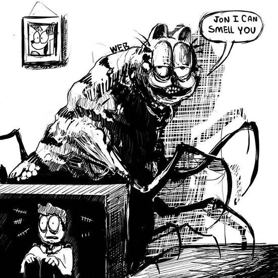
I leave you with a terrifying image of "garfield." Enjoy...